 Dream in PANTONE Color!
Article By | Delores Crum, Party Time Rentals
Photography By | Third Eye Samuel Photography
 Sleep scientists and Oneirologists (those who study dreams) once debated whether people dream mainly in color, or mostly in black and white. Interestingly, while most people report colorful dreams, according to the website, verywellmind.com, “roughly 12% of people claim to dream only in black and white.” This site’s post, entitled Interesting Facts About Dreams (Kendra Cherry, 2-11-21), adds, “In studies where dreamers have been awakened and asked to select colors from a chart that match those in their dreams, soft pastel colors are the most frequently chosen.”
 How colorful, literally and figuratively, are your dreams? When you’re thinking about your wedding, or perhaps your next special event, what colors do you see? What colorful selections are reflected in your vision of your special day? Whether or not we’re aware of it, our color choices are invariably influenced by a group of color forecasters, headquartered in Carlstadt, New Jersey and known as Pantone. In the 1950’s, a printing company employee, Lawrence Herbert, created the Pantone Color Matching System, a standardized color reproduction system, presently comprised (new colors are constantly added to the spectrum) of 2,161 color options. That invention changed consumer behavior to an extent we could not ever have imagined.
 Since 2000, Wikipedia tells us that the Pantone Color Institute has declared a particular color ‘Color of the Year’. Twice a year the company hosts, in a European capital, “a secret meeting”, and, after two days of presentations and debate, they choose a color for the following year.” Why does that matter to you? Unless you’re a graphic artist, fashionista, florist, or colorist (someone who uses colors in an interesting or original way), colors, along with their shades of intensity and nuances of meaning may not mean much to you. You just know what colors you like… and those that
you don’t. Maybe you’re drawn to the bright colors of summer, pastels of spring, warm hues of autumn, or icy winter tones.
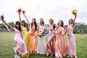 Nevertheless, at least to some extent, others, like Pantone, are making color choices for you. ‘They’ are determining the colors we’ll see in fashion, textiles, furniture, and more. Lest you doubt Pantone’s power, consider that the two colors declared ‘Color of the Year’ for 2021 were Ultimate Gray and Illuminating. Seemingly overnight, shades of gray, often combined with yellow tones, dominated every home and fashion design and décor decision.
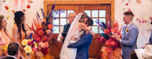
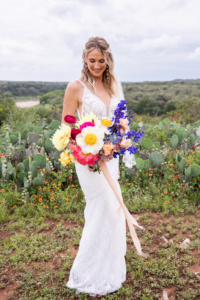
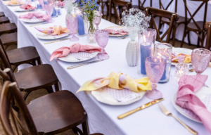
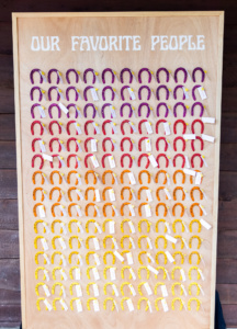
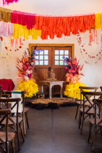 Very Peri is the first Pantone color for 2022. Google tells us that, according to the experts, “Very Peri, a warming, bold lavender tone – [is] a brand new shade that Pantone has invented from scratch.” While we’ve not loved every Pantone color unveiled in recent years, we do LOVE this one, and hope that you, too. Whether you decide to use Very Peri for your wedding, or choose to go with a completely different style, we hope you’re inspired by this bride’s creative use of some of our favorite Pantone selections!